A Dutch designer has created a font specifically for people with dyslexia, intended to stop the text from performing alphabetic gymnastics like reversing or flipping over backwards when they’re trying to read. “[P]eople with dyslexia unconsciously switch, rotate and mirror letters in their minds,” Christian Boer, the font’s creator, told design site Dezeen. “Traditional typefaces make this worse, because they base some letter designs on others, inadvertently creating ‘twin letters’ for people with dyslexia.”
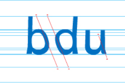
In Boer’s font,which is called Dyslexie, those “twin letters” — like b and d — lean slightly slanted to the left, and their openings are distinctively shaped.
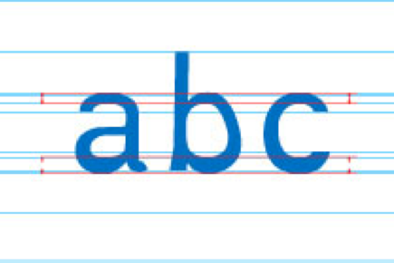
And all of the letters are thicker at the bottom, which, Boer says on his website, keeps them from flipping around in the reader’s mind.
We should note that while reversing letters is certainly a symptom of dyslexia, it’s not the only one; it’s not even necessarily the defining symptom. Dyslexia is a language-processing disorder, which means that people who have it often have trouble with words that extends beyond reading text. Many find it difficult to understand sarcasm, idioms, or other things not meant to be taken literally, for example; others may stumble when trying to summarize the main plot points of a story. But for those who do struggle with reading, this font is a cool and potentially very helpful idea.