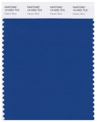
Pantone’s color of the year is Classic Blue. You could also call it 19-4052, if you geek out on that kind of stuff.
How to describe Classic Blue? If Yves Klein Blue had a baby with Indigo Blue, it would be Classic Blue. There’s a little Royal Blue in there somewhere, too, so maybe there could be some Yves-Indigo-Royal love triangle thing. Pantone describes the color as “a boundless blue evocative of the vast and infinite evening sky.” It’s very soothing — anti-anxiety blue, if you will.
So, how did they land on this color? Team Pantone looks at trend forecasts, fashion, beauty, lifestyle, political views, media, street art, travel destinations, new technologies, and new textures — to name just ten of the categories they consider. Then it’s time to narrow it down to a color family. And they found it was a blue mood.
“The color has to be emblematic of a global mood,” explains Laurie Pressman, vice-president of the Pantone Color Institute. She says this year’s pick harks back to the year the Pantone first began selecting colors of the year, two decades ago.
“In 1999, everybody was nervous about Y2K,” she explains. “Some of us were excited, some of us were shaky. ‘Is the world going to blow up?’ And here we are, heading into 2020, which I always referred to ask the ‘future’ and now we’re living in it. And we’re looking for same color characteristics and factors that would instill calm, confidence, and connection. With blue, this always comes to mind.”
Back then, the first color of the year was called Daylight Sky. Classic Blue is also sky-related, but the sky at dusk.
“It’s thought-provoking and a little deeper, but not a deep navy,” says Pressman. “This blue is not taking you into the mystery of what lies ahead. Instead, it speaks to our need for a stable and dependable foundation. We’re living in a time that requires trust and faith. We’re looking to those we can depend on.”
The past three Pantone Colors of the Year have been Greenery, Ultra Violet, and, last year, Living Coral — all bright but decidedly nonpartisan shades. You could argue that this one reads Democratic, but I think it’s significant that it’s so soothing. It’s a color for going into an election year, one that says, “Better rest up before the battle. But before you pull the covers over your head, would you take a look at how gorgeous the sky is?”


