

We — and that “we” encompasses anyone who lives in the designed world, not just New York City — are all surrounded by the work of Massimo Vignelli. The industrial and graphic designs he made (on his own; with his wife, Lella; and through the influential firm he co-founded, Unimark International), are everywhere, often so much so that we barely see them anymore. The recently retired twinned A and eagle of American Airlines, in red and blue on sparkling aluminum aircraft skin, are his creation. So is that ubiquitous desk calendar with oversize Helvetica numbers. So, of course, is the signage system of the New York City subway system, built in collaboration with Bob Noorda. (Helvetica, that cleanest-of-clean Swiss typefaces, was his hallmark, and he depended upon it even as it went somewhat out of style, then came roaring back in.) Vignelli died in New York yesterday morning, at the age of 83, and New York asked five designers and architects to choose and discuss their favorite pieces from his canon.
Michael Bierut, Pentagram partner and former Vignelli employee:
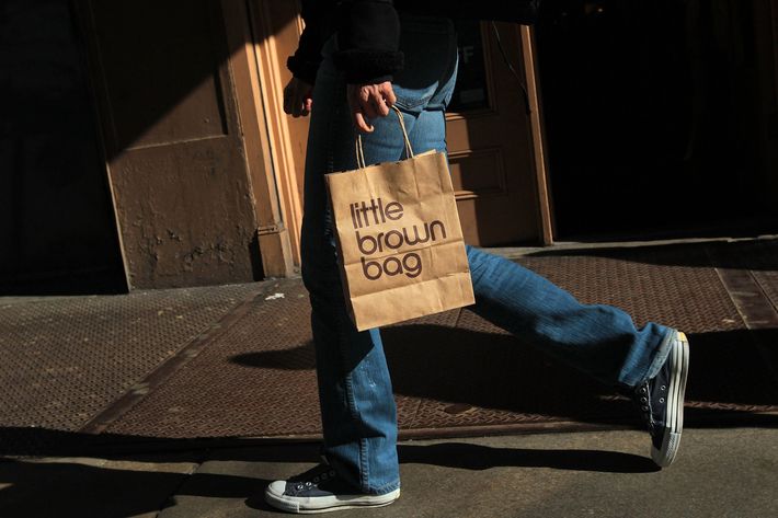
For a while in the late seventies and early eighties, whether you went shopping at Saks, Barneys, or Bloomingdale’s, you came home with the same thing: a bag designed by Massimo Vignelli. Of the logos he designed for those three stores, the one for Bloomingdale’s has endured. And no surprise: It’s the simplest. Starting with the classic Bauhaus typeface Futura, Massimo trimmed the extraneous details, merged the double Os, and turned a cumbersome 13-letter word — a nightmare for most logo designers, trust me — into an elegant, stylish composition of lines and circles. Rumor has it that the solution was completed minutes after the client had walked out the door; Massimo waited several weeks to reveal it in order to justify his fee. Whatever it was, Bloomingdale’s got its money’s worth.
__________________
Steven Heller, author and co-chair of the School of Visual Arts designer-as-author program
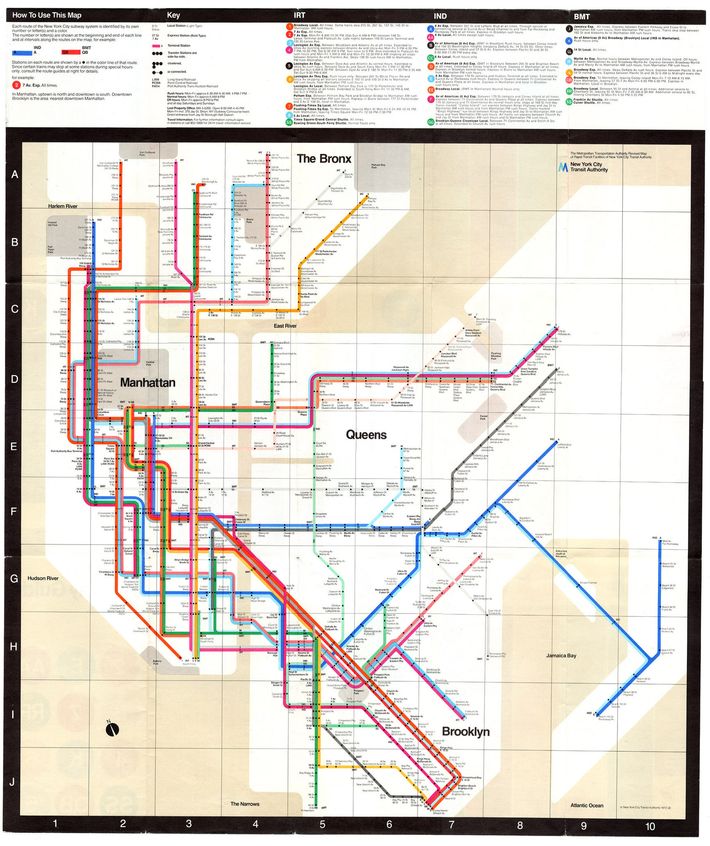
What makes Massimo Vignelli’s 1971 NYC subway map such a brilliant failure — yet a masterpiece of information design — was not the untangling the web of train lines, which it accomplished nicely. It was the radical shift from traditional map to simplified diagram, which gave New York’s antiquated transit system an air of modernity. Combined with the new Helvetica type standards for signs and markings that Vignelli and Bob Noorda developed, the subway saw the light.
Vignelli’s transit opus was harshly criticized at the time and ultimately doomed by the Authority that commissioned it. Yet it has been perpetually celebrated. Disappointingly, not all the facets of his grand plan were put into practice. Vignelli envisioned an interrelated system of maps: an overall system map, a geographical map indicating the relationship of the subway to the geography, a detailed neighborhood map to re-orient the traveler upon arrival at a new destination, a pocket map, and what Vignelli called a “verbal map”— intended for the main stations that featured written directions from point A to point B in language that, he once told me, “Mama would use”: Take train #6 to 59th Street, transfer to train RR, and get off at Times Square. Vignelli’s verbal map addressed the needs of the public. Although one of them was implemented in Grand Central station, the verbal maps were shelved, along with the neighborhood and geographic maps — victims of budgets and bureaucracy. Only the overall system and pocket map survived.
Basing it on previous transit maps, notably Beck’s London Underground, Vignelli organized his subway diagram on a grid, orienting the “spaghetti work” of the railways to the verticals, horizontals, and 45-degree angles of the page. Each line had a different bright primary color, and either a number or letter designation appeared at the beginning, at the end, and at intervals along the route. Every station was listed. Trains stopped at stations with dots. No dot, no stop. The web of lines dominated the background of white abstracted landmasses, with the surrounding waters a mid-range gray, and parks geometrically designated in a darker shade of gray. The map was distorted, with the central, more congested areas larger and the outlying areas truncated. Vignelli used layering, separation, and color to differentiate planes of information. This system of representation clarified what was important to the traveler: how to go from point A to point B. The map bypassed the literal details and focused on the relationships inherent in the information — less is more.
Soon after it was put into effect, Vignelli’s diagram was slammed for not being literal enough: The water was not blue; the parks were not green. The map was replaced in 1979. Aside from the awards it has won or its inclusion in museum collections and history books, its vindication came when, in 2012, Vignelli was commissioned to take the subway diagram digital. Vignelli and his associates, Beatriz Cifuentes and Yoshiki Waterhouse revived what was “Created in B.C. (before computer) for the A.C. (after computer) era,” Vignelli told me with a wiinning smile.
__________________
Murray Moss, owner, Moss design store

I loved Massimo. The man, the person. Massimo and his Lella. Italian Americans who, with time and almost unnoticed, morphed into American Italians.
Massimo was so much more than his work — the works he and Lella produced were the by-product of very serious people who loved discipline and rigor almost as much as they lived for spontaneity. He was a joyous man, a truly decent human being, whose optimism was as infectious as that of my favorite Uncle Max, and who loved to Love.
He’s the guy you wanted to find when you got to the party.
The first tableware I ever-ever-ever bought for myself was the Heller set by Massimo and Lella. I remember waking up mornings and taking a coffee in that shiny thick white mug, and wanting to run out the door and Conquer the World. I’m not sure why, but there is definitely something strong and encouraging and smiley and animated and .. .wel l… present about it — something that projects “I may be a mug, but move over!”
Like Massimo.
__________________
Billie Tsien and Tod Williams, architects
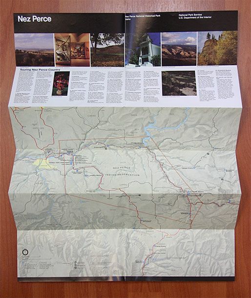
Tsien: Tod and I turned off U.S. Route 550 and headed down 14 miles of really rough, really dusty dirt road. The last four and a half miles, the rental car was straddling deep crevices all the way. When we finally pulled up to the entrance gate of Chaco Canyon, hot, thirsty, and crazy from the drive, we were handed a piece of cool, crisp elegance. It was a beautiful folded National Park Service map designed by Massimo Vignelli. It was like suddenly being handed a flute of perfectly chilled prosecco. Based on his Unigrid system of 12 rectangles, it made efficient use of ink and paper, and allowed folds to occur in propitious locations. Crowned with the regal Helvetica, it was and is a thing of beauty. After each trip, the creased and torn maps are carefully filed away — a packet of memories perfectly designed.
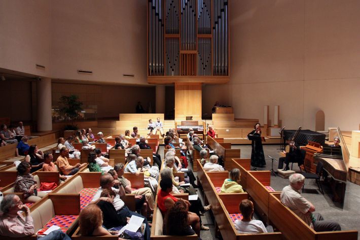
Williams: Massimo and Leila have been giants and difficult to separate in their individual contributions. Celebrated for their gracious humanity and the corresponding elegant clarity of their graphic design work, the lovely serene artistic intelligence of the interior of St. Peter’s church is often overlooked.
__________________
Paula Scher, Pentagram partner
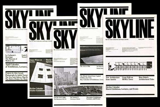
I fell in love with Skyline magazine when I first saw it in 1978. I admired the tall, thick, powerful logotype and the organizing principle of the thick black bars housing contents and photos. It was so right for the publication, so architectural. The design had perfect scale. It was like a snapshot of New York City, gridded, black and white, a spire on top supported by a myriad of stories.
When I first saw it, probably at an AIGA exhibit, I was a young record-cover art director and didn’t know that so much of Skyline’s design and layout was signature Vignelli style. I also didn’t know it was “modernism,” which, at that time, I equated with the Swiss Interntional style (which I defined as Helvetica used on a grid system for the sole purpose of looking clean). Skyline seemed to be something else. I thought the magazine’s design was conceptual and illustrative in the fact that it used the typographic choices, scale, and organization of information to convey spirit, not just order.
I just looked at it again while writing this, and I feel the same way about it now. It hasn’t aged a bit.