This article was featured in One Great Story, New York’s reading recommendation newsletter. Sign up here to get it nightly.
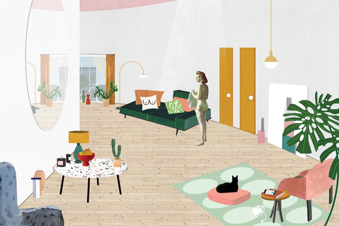
You walk beneath a white molded archway. You’ve entered a white room.
A basketlike lamp hangs overhead; other lamps, globes of brass and glass, glow nearby. Before you is a couch, neatly tufted and boxy, padded with an assortment of pillows in muted geometric designs. Circles of faded terra-cotta and pale yellow; mint-green and mustard confetti; white, with black half-circles and two little dots — aha. Those are boobs. You look down. Upon the terrazzo nougat of the coffee table, a glass tray trimmed in brass. It holds a succulent in a lumpy ceramic pot, a scented candle with a matte-pink label. A fiddle-leaf fig somewhere looms. Above a bookshelf (spines organized by color), a poster advises you to WORK HARD & BE NICE TO PEOPLE. In the far corner, within the shrine of an arched alcove, atop a marble plinth: one lonely, giant cartoon jungle leaf, tilting from a pink ceramic tube. You sense — in a way you could neither articulate nor explain — the presence of a mail-order foam mattress somewhere close at hand.
All that pink. All those plants. All that white. It’s so clean! Everything’s fun, but not too much fun. And there, in the round mirror above the couch: It’s you. You know where you are. Or do you?
Search your brain. Swap out the monstera leaf for waxy red anthurium, WORK HARD & BE NICE TO PEOPLE for GOOD VIBES ONLY. Maybe the pillows were succulent-print; maybe the ceramics had boobs. IT WAS ALL A DREAM, says a neon sign in schoolgirl cursive. You hadn’t noticed that before.
Maybe it is a dream, this room you do and don’t know, assembled from cliché and half-recollected spare parts; a fever dream — or, no, that’s too much. This room functions more like a CBD seltzer, something you might buy in a salmon-pink can. There’s not a lot of distinctive taste, but still, it’s hard to resist when you’re on a permanent search for ways to feel better. The ambience is palliative — simple but not severe. Even the palette faintly suggests a medicine cabinet: powdery pharmaceutical pastels, orange pill bottles, Band-Aid pink.
Now imagine that the white room isn’t a dream; it’s behind a velvet rope in the American Wing at the Metropolitan Museum of Art. Perhaps it’s a home, or a store, or maybe the two cases blur — a store designed to look like a home, a home in which one might shop. An interior filled with recognizable products.
“Peggy” sofa (ca. 2015): A mid-price offering from the chain retailer West Elm, the model’s name evoked the heroine of popular television drama Mad Men, widely admired for its re-creation of the previous century’s design. (Discontinued 2017, following a viral essay titled “Why Does This One Couch From West Elm Suck So Much?”)
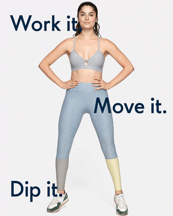
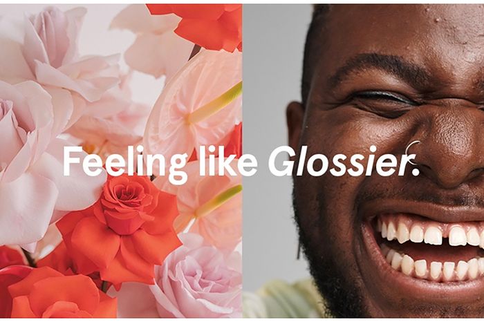
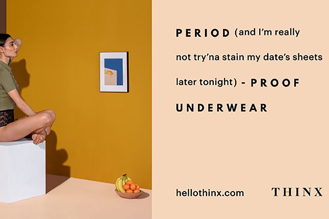
The future museumgoer would naturally require some sort of digital experience — some screen — to fill in the view from that couch. So in lieu of an audio tour, mounted nearby there’s a replica rose-gold iPhone 7. Swipe for a selection of other clean, white, curvilinear interiors. There’s a place to do laundry that looks like a spa, a place to get therapy that looks like The Wing, a boutique newsstand that sells scented candles and has an app. A dental clinic called Tend provides “curated, seasonal toothpaste” in what’s billed as “The Brushery”: a “swishy, swirly room just for freshening up” (it has marbleized turquoise concrete sinks). And then there are advertisements, making up a visual world of their own. The products on view — cookware, supplements, stretchy clothes — occupy blank pastel landscapes manipulated by a diversity of hands. These aren’t ads that bellow or hector; they whisper, in restrained sans-serif fonts, or chastely flirt, in letters with curves and bounce. They’re ads, sure, but they’re so well designed.
In this era, you come to understand, design was the product. Whatever else you might be buying, you were buying design, and all the design looked the same.
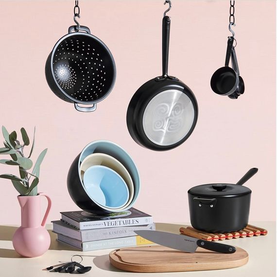
Ever since modernism brought industry into design, tastes have cycled between embracing and rejecting what it wrought. A forward-looking, high-tech style obsessed with mass commercial appeal will give way to one that’s backward-looking, handmade, authenticity-obsessed — which will then give way to some new variation on tech-forward mass style. (Furniture dealers joke that “brown” goes in and out with every generation.) It’s a logic that gets filtered through the reliable desire for the world the way it looked when we were young, and lately this has meant looking back 30 or so years to the Memphis-inflected pastel pop of the ’80s and ’90s. We might call the latest iteration of the cycle the “millennial aesthetic” — not to say that it was embraced by all millennials, just that it came to prominence alongside them and will one day be a recognizable artifact of their era.
Consider a previous youth-style shorthand: the hipster, preeminent cultural punch line of the aughts. Both hipster and millennial were terms that drifted away from strict definitions (hipsters being subcultural, millennials being generational) to become placeholders for “whatever fussy young people seem to like.” It is strange, now, to remember a time when chunky-framed glasses were understood as a hipster affectation; today they just look like Warby Parker. The hipster aesthetic harked back to a grimy past: Its spaces were wood-paneled, nostalgic; perhaps they contained taxidermy. Behind lumberjack beards and ’70s rec-room mustaches, there was a desire for something preindustrial or at least pre-internet.
The hipster was Vice; the millennial is virtue, or at least virtuous consumption. The hipster aesthetic was capable of rendering even plain cotton T-shirts a little gross under the gaze of Dov Charney — the grossness was, indeed, part of the appeal. The millennial aesthetic, meanwhile, could take something disgusting and attempt — through sheer force of branding — to make it cute and fun. One such product, called “Come&Gone” (sans-serif logo, pastel website, friendly gifs), attracted notice on Twitter last year. Essentially a sponge on a stick, it was marketed as an “after-sex cleanup” device by a start-up “on a mission to ban the dripping, forever.”
Sometimes the hipster flirted with racism and misogyny, couched as irony or provocation — a certain performance of exclusivity (even just daring your audience not to get the joke or know the band) was central to the hipster aesthetic’s appeal. But the millennial aesthetic aims its appeal at everyone. Propagated by brands and advertisements, it is a fundamentally commercial aesthetic — and why alienate any potential customer? Millennial marketing showcases models of many races and body types, and the products on offer are obvious in their charms. Every sofa and soft-cup bra presents itself not as evidence of distinctive taste but as the most elegant, economical, and ethical solution to the problem of sofas or soft-cup bras. Simplicity of design encourages an impression that all errors and artifice have fallen away. The millennial aesthetic promises a kind of teleology of taste: as if we have only now, finally, thanks to innovation and refinement, arrived at the objectively correct way for things to look.
If you simultaneously can’t afford any frills and can’t afford any failure, you end up with millennial design: crowd-pleasing, risk-averse, calling just enough attention to itself to make it clear that you tried. For a cohort reared to achieve and then released into an economy where achievement held no guarantees, the millennial aesthetic provides something that looks a little like bourgeois stability, at least. This is a style that makes basic success cheap and easy; it requires little in the way of special access, skills, or goods. It is style that can be borrowed, inhabited temporarily or virtually. At the very least, you can stay a few hours in a photogenic co-working venue. At the very least, Squarespace gives you the tools you need to build your own presentable online home.
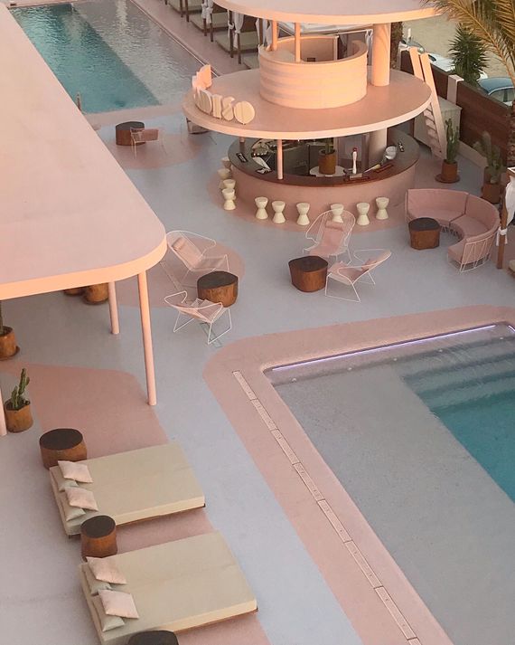
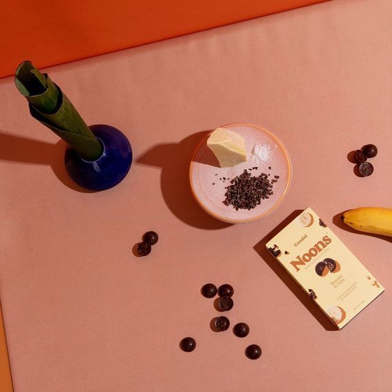
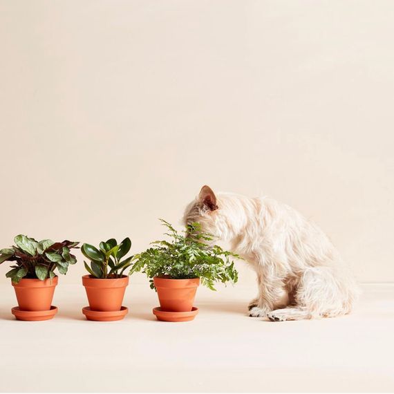
When Sarah Sherman Samuel decorated her first pink room, she assumed she was doing something sort of daring. But no: Pink was a crowd-pleaser, Samuel soon learned. Or, it was crowd-pleasing when she tempered it with the warmth of wood, something to cut the sugar high. Samuel is an interior designer employed by clients like Mandy Moore, born 1984. (Moore’s house, with its pale terrazzo floors and upholstery in pink and ocher, was on the cover of Architectural Digest in 2018.) Pink became a crucial ingredient in the serene millennial dreamscapes with which Samuel has made her name.
No account of the millennial aesthetic could fail to address pink: For the better part of a decade, millennial pink bedeviled anyone a color could bedevil. When Facebook rolled out a corporate rebrand last fall, the lead image in the press release showed the new logo — breezily spaced sans serif — in a muted shade somewhere on the ham-to-salmon spectrum. Samuel keeps wondering when people will get sick of the color, but they don’t; almost every client asks for pink. She thinks this is because it’s soothing. They want houses that remind them of vacations, suggest Mediterranean idylls.
“It kind of feels like a binky,” Deborah Needleman, the former editor of T, WSJ., and Domino, says of millennial interiors. (Boob-print pillows and bath mats are perhaps the most literal expression of a general tendency toward the comforts of babyhood.) Needleman sees not a trip to Greece but something more like childproofing. “It’s like it has no edge or sense of humor or sense of mystery,” she says. “There’s no weirdness. There’s nothing that clashes. It is very controlled.”
Pink is not the only soft color in the millennial palette. There’s green, often in the form of plant life — it has a wholesome appeal next to the pink — and then an expanding array of colors simultaneously saturated and chalky, muted even when not actually pastel: seafoam, terra-cotta, lavender, and (especially) ocher. In explaining the appetite for colors that soothe, we might gesture vaguely in the direction of Now More Than Ever, anxiety, the news. A more direct explanation would probably be that other stalwart of millennial pop sociology: the phone, now the basic tool with which we view, record, and disseminate images of the world. All that time spent staring into a glowing screen makes the prospect of something gentle — something literally easier on the eye — enticing. The millennial palette is the opposite of glare; onscreen or off, it’s color softly veiled.
Pink is a color with baggage, of course. It arrives trailing associations of repressive femininity from previous eras of pastels: the 1950s, most pointedly, but also a childhood of 1980s and ’90s Barbie plastic. Millennial pink mutes those bright bubblegum colors, chews them up a little, leaves them faded. In doing so, it suggests a slight, winking self-awareness, albeit one that stops short of irony or critique. It’s pink that’s sweet even though it knows better. And something of the tension captured in that color — a placid surface and a knowing attitude — seems to mark the millennial aesthetic at large. It is a constantly self-conscious sensibility, that of someone who is always performing, always watching themselves be watched: Maybe that was once primarily the condition of women, but it seems increasingly to apply to us all.
If the millennial aesthetic crystallizes most clearly in realms associated with femininity (style, beauty, wellness, domesticity), it has diffused outward to goods and businesses of all sorts. The design is soft in its colors and in its lines, curved and unthreatening — not unlike the iPhone, as Jessica Helfand, the co-founder and creative director of Design Observer, points out. It is beveled, as are all the little logos for apps that inhabit it, framed by smoothly rounded edges. “The bevel by its very nature suggests ‘friendlier’ — like, easier, softer,” Helfand says. “True modernism, true minimalism, would be the square.” Minimalism, however, demands severity, and the millennial aesthetic has none.
To Needleman’s eye, the effect is anomalous, ahistorical. “It feels like its own little bubble,” she says. It’s possible to pick out vague references here and there — the cleanness of mid-century modern, the selfie-optimized pink glow of an Ultrafragola mirror. Needleman points to the curvy furniture of designers like Vladimir Kagan or Pierre Paulin as precursors. “But none of this has the design rigor that those things had,” she says. “Everything now just seems saccharine.” Styles that might once have been provocative or challenging become palatable and easily understood. They conjure, if anything, some bygone idea of the future — somehow looking neither forward nor back.
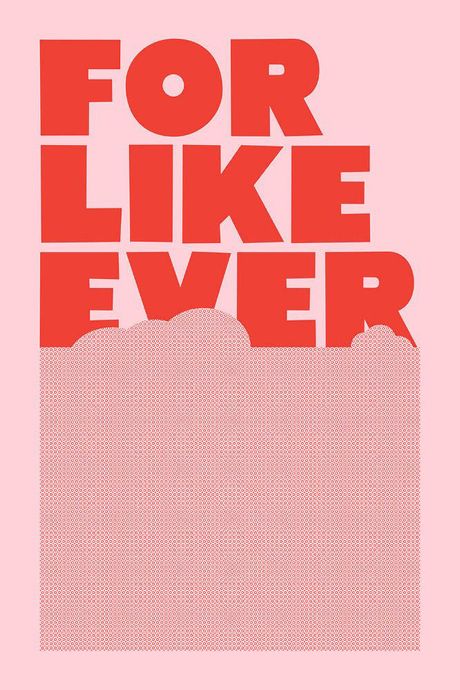
One of the first soft, pink harbingers of the millennial aesthetic appeared in 2004, created by Tracy Jenkins, then a graphic-design M.F.A. student at Yale. It was a poster printed in red ink on cheap, pale-pink paper: ice-cream-scoop clouds and above them, in fat block letters, the words (overheard from a student) FOR LIKE EVER.
Jenkins’s professor — steeped in the elaborately designed postmodernism of the ’80s and ’90s — hated it. But for Jenkins, pop simplicity was the point. “I think big and dumb is valid,” she says now. After graduation, a classmate encouraged her to print up more copies. Jenkins and her husband gave them away to clients at their type foundry; sometimes they’d sell one on its own for $10. Then one of those posters wound up framed in a home on the cover of Domino. This was 2006, and FOR LIKE EVER went viral, insofar as going viral was possible at the time. By 2018, Apartment Therapy included the poster alongside succulents and sheepskin as a square in “Millennial Apartment Bingo.”
Today, Urban Outfitters sells a pink-and-red poster that says COOL TO BE KIND and another that says BAE BAE BAE. A voice of chatty positivity, conveyed via fun typography, pervades walls, ads, and social media. The text is casual, friendly, and impersonal — the verbal equivalent of a beveled edge. And perhaps all those words are just the logical end point of a broader tendency to prize legibility. Instagrammable is a term that does not mean “beautiful” or even quite “photogenic”; it means something more like “readable.” The viewer could scroll past an image and still grasp its meaning, e.g., “I saw fireworks,” “I am on vacation,” or “I have friends.” On a basic level, the visual experience of a phone favors images and objects that are as legible as possible as quickly as possible: The widely acknowledged clichés of millennial branding — clean typefaces, white space — are less a matter of taste than a concession to this fact.
Before Samuel began working on interiors, her training was in graphic design, which has proved to be an advantage: “I think about it in all the different points of view — how it will look flat in a photo as well as how it moves as a space.” The summary of services she provides clients in her contract promises “Instagram-ready interiors.” The millennial aesthetic flows freely between physical space and flat image, between brands and the people who buy.
Emily Heyward remembers when she sensed that everyone was becoming more aware of design. Heyward is the co-founder and chief brand officer at Red Antler, the Brooklyn-based branding firm behind companies like Allbirds, Burrow, and Prose. A couple of years ago, friends started asking her: Why do so many brands use sans serif? Heyward thought about fonts all the time, but she was unaccustomed to interest from nonwork friends, let alone familiarity with the jargon.
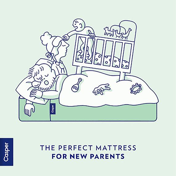
Heyward and her company often take on clients that are still embryonic; they started working with the mattress company Casper when Casper didn’t have its mattress yet. The approach is deliberate; it means design and branding become a part of the company early on, so Red Antler helps shape the way a company does business, not just its logo and name. Red Antler’s clients sell steak, scented candles, antacid, premium bus travel, engagement rings, and insurance, among many, many other things. Visiting recently, passing through the industrial-design team’s area, I saw a stack of orange bins. These were for the disaster-preparedness start-up Judy, my guide explained. Once stocked, the bins will retail for $250 and contain 72 hours’ worth of survival supplies — including a first-aid kit, meal bars, and water — to sustain a family of four. It had not previously occurred to me that the millennial aesthetic might come for the apocalypse, but I was not entirely surprised.
It was roughly 20 years ago that companies like Target and JetBlue found success with a new kind of marketing strategy. They weren’t selling luxury, but they weren’t hawking bargains either; instead, they were using design as a way to address potential customers as discerning and savvy. The new crop of direct-to-consumer brands (among them Red Antler’s clients) pick up where companies like these left off, while relying on design in a more essential way. For an unknown start-up cutting out the middleman on sneakers or shampoo, design performs the work of salespeople and stores: It’s the hook, but also the promise of legitimacy. And as companies devise offerings that are less about innovation than about making familiar experiences more pleasant, design looms ever larger.
Heyward is emphatic that no business can succeed on the strength of good design alone. Not long ago, for example, her wife bought a nightgown from a brand on Instagram that “looked really cool.” But the shipping was slow, the customer service unresponsive, the packaging (when the nightgown finally arrived) poor. So: “She’s not going to buy another thing from them ever again.” The Red Antler philosophy is that real success requires that a brand offer the customer something “magic.” Without that, Heyward says, “someone else is gonna pick a similar font, and there’s going to be no way to tell the two apart.”
As the millennial aesthetic grows omnipresent, as its consumers grow more design-fluent, our response grows more complex. We resent its absence (Why is this restaurant website so crappy?) but also resent its allure; we resent that knowing the term sans serif does not make you immune to sans serif’s appeal. The desire for individuality rebels against its sameness, even as the sameness feels reassuring, feels good. In the 2019 book How to Start a Revolution, Lauren Duca complains on behalf of a millennial cohort about politicians’ “refusing to cater to us as political customers.” Market to me better, she demands: “Assembling the stock crap that my generation is drawn to doesn’t require a marketing genius. You get a potted plant, a neon sign, and a nice bold sans-serif font, and boom, you’ve got a subway ad for the latest disruptive millennial brand.” She seems to be saying that she does indeed want politicians to assemble that stock crap, but still, it’s hard to miss the note of contempt.
Today, the Elizabeth Warren campaign sells pastel sans-serif posters, displayed in its online store alongside a fiddle-leaf fig. The Pete Buttigieg campaign provided supporters an extensive online branding-and-design tool kit: Its “brand story” called him a millennial twice in three sentences, and its color palette (“deeply rooted in Pete’s hometown”) included mustard, muted orange, and rosy beige. If anything, the Buttigieg campaign’s strenuously millennial design efforts seemed to have primarily inspired millennial disdain.
The millennial aesthetic can be enlisted to try to sell anything, as has quickly become apparent. In the midst of an organizing drive at NBC last year, an anti-union Instagram account briefly appeared. The account shared slogans like dues are for the gym on pastel backgrounds; women’s health care would be “subject to negotiation,” warned one post, with cartoon hands in a range of skin tones and nail-polish shades making peace signs along the border. “Millennial Pinkerton,” commented artist and writer Molly Crabapple.
The legitimating power of clean lines is one thing when applied to meal kits and face wash, another applied to politics and people. “This is a thing keeping me up at night, actually,” says Helfand. “To what degree does design confer false authority on anything it touches?”
It is hard to imagine ourselves growing old — to imagine the time, nearly upon us already, when “millennial” no longer means “young.” Likewise, it is hard to imagine how the millennial aesthetic will age. Its blank, clean surfaces aspire to a world without clutter or scuffs, unmarked by the passage of time. In this aspiration, the millennial aesthetic is somewhat democratic — anything can be new, for a while. It is a style that looks, in its ideal state, like a purchase.
When I try to imagine the millennial aesthetic someday becoming the past, I think of the work of artist Sara Cwynar. Trained as a graphic designer, now working in still photography and film, Cwynar (a millennial) is interested in the way advertising and advertised objects decay. Her 2017 film Rose Gold places the rose-gold iPhone, produced between 2015 and 2017, alongside older artifacts of taste.
“I keep buying these plastics called melamine,” says the voice-over, panning over a row of pastel cups. Melamine is another past that once looked like the future; Russel Wright, the industrial designer whose ceramic dinnerware brought modernism to millions of postwar homes, sold melamine dishes, too. Their ovoid plastic forms, in colors like salmon and pale blue, today look both dated and contemporary.
In Rose Gold, Cwynar piles her melamine in yard-sale heaps alongside millennial-pink Acne shopping bags. “This product was marketed as indestructible,” the voice-over says, as pink cups crash to the ground and shatter. Her mid-century plastic and its faded guarantees are evidence of an era like ours, when bright surfaces and new conveniences presented an appealing alternative to existential dread. Looking back, their inadequacy is obvious. But pink hits a pleasure center, a promise sounds good, and in the moment perhaps you don’t resist. “I love the rose-gold iPhone,” Cwynar admits. Rose Gold ends, and the film reverses; shattered pink melamine cups reassemble themselves and float.
What the millennial aesthetic sells, it sells through the promise of novelty. This is true even when the product on offer is not appreciably novel: cat food, Dutch ovens, and generic drugs are repackaged, redesigned, as if millennial buyers required a version all their own. Jessica Walsh, a graphic designer and founder of the creative agency &Walsh, dates the style to the last five years and sees its expiration date approaching already. “Everyone wants to look like the Casper, Warby Parker, or Aways of the world,” she explains, which has made branding increasingly interchangeable. “People are tired of the sameness and already craving something new.”
When the time comes — when smooth pastels start to feel a little tacky, when brown starts looking good again — what will be saved? As in any era, most of our belongings will be lost, but fewer than ever seem worth trying to preserve. In her article “Why Does This One Couch From West Elm Suck So Much?,” author Anna Hezel asks employees in a West Elm store how long that “Peggy” couch was, ideally, supposed to last. One to three years, they inform her.
Last year, the interior-design start-up Homepolish collapsed; last month, Casper made its disappointing IPO; last week, Outdoor Voices CEO Tyler Haney stepped down amid reports that her company, based on tastefully colored leggings, was losing cash. Design created an astonishing amount of value in the last ten years, and increasingly that value looks ephemeral. I remember visiting WeWork corporate offices in early 2016 and telling a friend that the space already felt period — larded and spackled with efforts to look designed ca. 2016, which now sounds like a very long time ago. Of course, I can also look around my apartment and see what threatens to wilt: boob poster, pink blanket, plants. We have lived through a moment in which design came to seem like something besides what it was, like a business model or a virtue or a consolation prize. The sense of safety promised in its soft, clean forms begins to look less optimistic than naïve.
*This article appears in the March 2, 2020, issue of New York Magazine. Subscribe Now!
More From the spring 2020 fashion issue
- Our Favorite Spring Runway Looks, Reimagined As Candles
- The Fashion Industry’s Librarians of Luxury
- Needles, Diamonds, Smoke, and Bruising
- Throw Out Your Bra, Already
- 1 P.M. at La Grenouille


